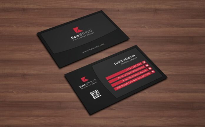
Almost everything we do amidst our businesses is digital today, from sending emails to scheduling meetings, business marketing seems automized extensively. Even though online marketing is a rising fact, there is one thing that online marketing will never be able to replace: business cards! Now, you might be wondering: are business cards important in our digitalized world? The answer is: they are, and let us tell you why.
Business cards are essentially used for networking, and no matter how convenient sending contact information via text or email seems like to you, it does not carry that personalized feeling. An in-person meeting involving direct eye contact between two people and giving the business card after the handshake is substantially better than typing away in your phones, without actually meeting the other individual in person.
After all, networking is all about making genuine connections, and an inspiring conversation at a business seminar with individuals is more impactful and memorable than conversing via email.
Do you want to leave the most memorable first impression? Do you want your prospective audience to be “wowed” the moment they see your business card? Congratulations, you have landed at the right place! The entire goal of a business card is to convey an impressive image of you and your organization within the allocated 2.5-3 inch space.
We are about to unleash 6 secrets of designing the best business card for your business, making the best use of the small space, so stay tuned!
1. Logos and color scheme
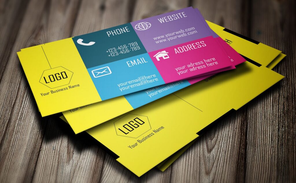
These 2 components are the essential elements you should be ready with before proceeding towards designing your business card. Not only do logos and colors play an important part themselves, but they also influence other ideas such as layout, identity, and text within the card. A color scheme helps you decide the color to use for your text, contrast between any images or design that you may want to include, etc.
Moreover, if your brand logo is eye-catchy, it gains the viewer’s attention within seconds, and he is compelled to read the rest of the information on the card. The color scheme gives off your business’ vibe. For example: if you own an environmental-friendly company, your business card should be self-explanatory with that mission consisting of green, blue, yellow colors and recyclable material.
For further details regarding in-depth color scheme and to view an array of options for your business card please visit basicinvite.com and explore your choices in seconds!
2. Experiment the shape
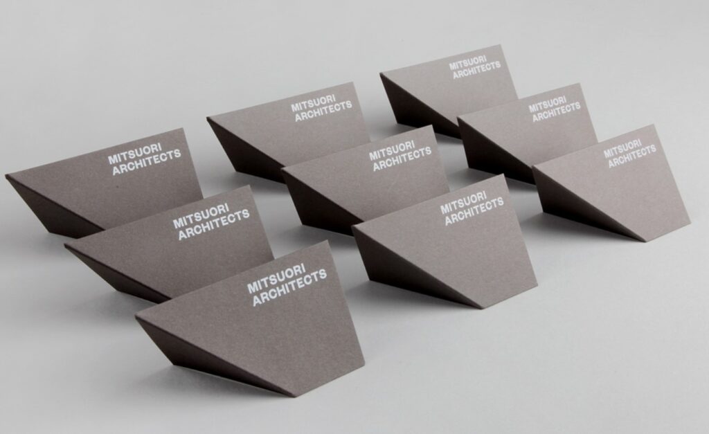
Do you want to go with the traditional rectangular business card or try an out-of-the-box idea for the “wow” element? We’d choose the latter and recommend you do the same. This is where you get creative with your imagination. Don’t worry about the added cost, though; the investment that a unique card can provide is unimaginable. A distinctive card gets shared amongst colleagues, stays with people for a long time, and gives the first impression you wanted to give out.
Now, you have a range of options. Think about your company first: what product/service are you offering? If it’s food-related, consider opting for a shape representing your signature product, for example, a drink can. If, on the other hand, your business is more formal, you should be more classy and decent while being a bit quirky.
For example: if you are in the banking sector, you may have a business card that is identical to a credit card with the metallic material and have your information on it. You can even have 3D business cards now, which might be foldable, so experiment according to your preferences. An idea could be this MacBook business card:
3. Material
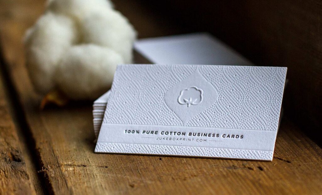
would you be impressed with someone who writes his information down on a tissue paper or someone who pulls out a metallic card? The latter. The same is the case when it comes to deciding the material of your business card. Your business card should show that you are well-prepared in the Corporate sector. Most business cards are printed on cardstock, but to design one that stands out, you should use a thicker material to begin with.
Moreover, you can even small pieces of metal, plastic, wood, and even slate. Use your business card as a source of an ice breaker with the other person. There is a high probability that they’ll initiate a conversation with you if you hand them over a metallic business card or a see-through/transparent card.
4. Figure out the information that will be printed
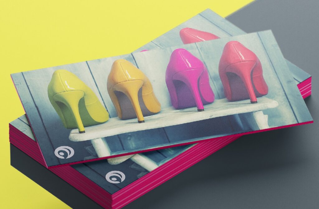
It is important to remember that you have limited space within the card, and you don’t want to cram it up with loads of information. That becomes unattractive and a burden for the reader to read.
Optional information may include Social media handles, QR code, and slogan or tagline of your company since it helps with brand identity. An exciting approach some businesses have recently adopted is installing slim USB drives within their business cards with all the information within it. This is a smartly impressive way to use digital marketing within in-person marketing.
5. Decide your typography
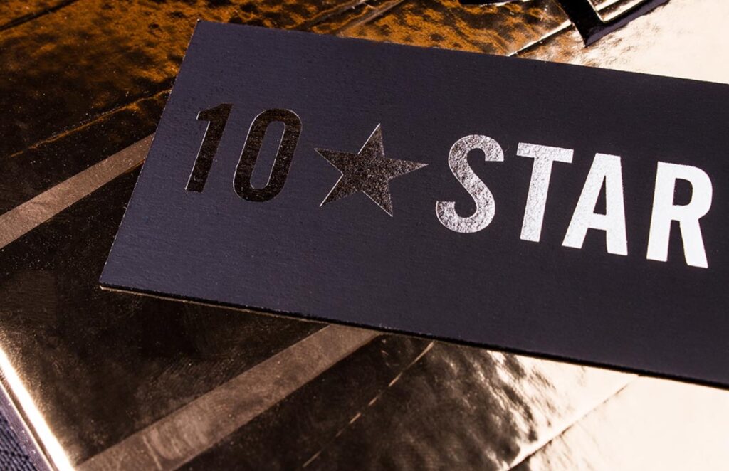
As you have decided what should be there within the card, now is the time to think about how it looks. Even if you plan on making a vertical business card, typography is an essential element. Typography includes three main components, the size, font, and color of your text.
For your text to be readable, it should be at least 8 pts, even though you can vary the size from place to place within your card. Some space is essential to avoid cluttering as well. The font should be according to your personality and the vibe you want to give off. A clean and modern sans-serif, a classic serif or a fancy Informal Roman, make your call!
The color of your text should be visible and attractive, plus it should also be in contrast with the background color.
6. Special finishes
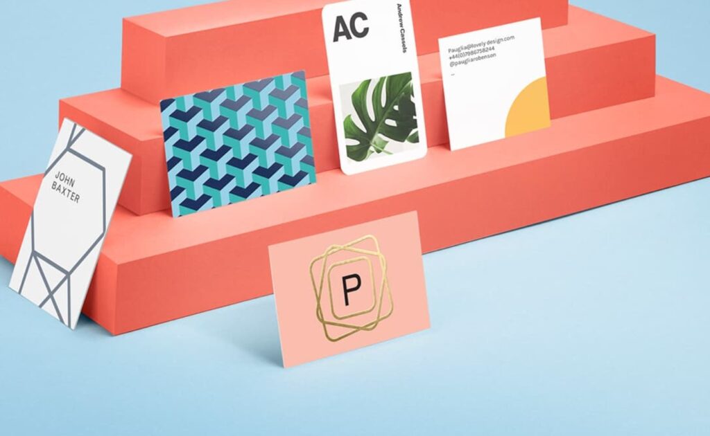
Using the power of printers is an optional but recommended step. You can use “embossing” to draw attention to specific aspects within your card as it pops out the text. On the contrary, you can use “letter pressing” to press the paper down, providing your text a heightened gravitas. To create a smooth and sleek texture, consider “spot UV coating” or want something shiny and reflective using “foil stamping.”
Conclusion:
Using these tips, you will be able to design the best business card that people will love to keep within their pockets at all times. Remember that your card is so much more than just contact information. It’s you and your company on physical material, so make it worth it!

