
Ever wonder why some avatar outfits pop off your screen while others fade into the background? Here’s a wild stat to chew on—there are over 40 million user-made clothing items inside Roblox right now. That’s not a typo. Standing out in that crowd takes more than a good idea. It takes smart design tricks.
You don’t need pro software. You don’t need ten years of art school. You just need the right strategy, a little trial and error, and a couple of insider secrets most players overlook.
Key Points
- Use the right template tool to save time
- Avoid blurry graphics with smart export settings
- Balance colors with contrast, not chaos
- Stay consistent across the front, sleeves, and back
- Add subtle texture for pro-level polish
- Always preview before upload
Master the Look with Simple Custom Roblox Shirt Tricks
Let’s fix flat designs. Let’s punch up your style without weird seams or low-res mistakes. The secret isn’t talent. The secret is smart steps, good tools, and testing every layer.
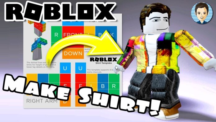
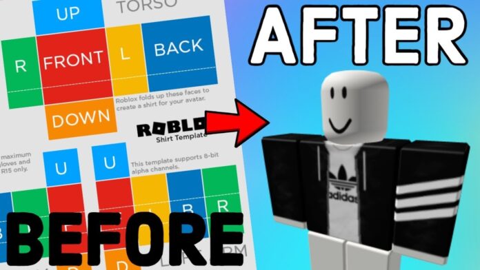
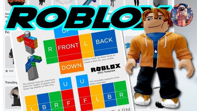
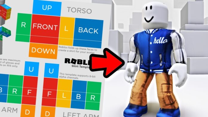
Start with the right canvas. A lot of beginners skip the setup and just drop paint on pixels. That causes alignment fails later.
Pro tip: Use a Roblox shirt template that has your layout ready to go. You can click right into it without even downloading the file. The editor already loads the format with all the right guides.
Every part—front, back, sleeves—needs its own care. But with a solid base, everything fits right.
Choose the Best Resolution for Clean Results
Pixel blur ruins even the best patterns. If your final upload looks fuzzy or stretched, your file size or export setting caused it. Don’t let that glitch steal your vibe.
Set your canvas to 585 pixels wide by 559 pixels tall. Nothing else. That’s the gold standard. Anything higher might look crisp on your screen but will downscale on upload.
Keep everything on one layer until you’re ready to export. Then flatten. Then save.
File Format Check
- Always use .PNG
- Never upload .JPG
- Double-check your transparency—no mystery pixels allowed
Use Color Contrast to Stand Out
Bold doesn’t mean loud. A good contrast can make even a black-and-white design feel alive. Use color to guide the eye, not confuse it.
Pick one main color. Add support tones that sit back. Then finish with a contrast color that leads the focus.
Many new designs fall flat because the background screams louder than the center. That flips the visual weight and ruins the feel.
Use this formula for a strong base:
- One primary tone (bright or dark)
- One neutral tone (white, grey, or black)
- One accent for contrast (opposite side of the color wheel)
Test combos before committing. Save color pair swatches for future projects.
Keep Elements Aligned Across All Sections
Symmetry matters more than most people expect. If your logo slices at the shoulder seam, users notice. It throws off balance and hurts your whole design.
Set up guide lines. Use tools that let you place boxes for chest, arms, and torso. That avoids misplacement.
Every side must connect. If the front has a stripe, the back needs to echo it. The sleeves should mirror each other or offer balance.
Rotate your preview view often. Don’t just design flat. Scroll around the 3D preview. Catch every weird edge before it goes live.
Every section must feel like one outfit. No afterthoughts. No random cuts.
Add Subtle Details That Upgrade the Whole Look
Tiny accents add big value. Texture creates depth. Shadows imply layers. Even a soft fade around a graphic sharpens the edge.
If your design looks too “blocky,” try adding these:
- Faint highlights near collar or sleeves
- Soft edge blur around logos
- Noise textures for a fabric feel
- Gradient backgrounds instead of solid color
Use light touches. Don’t over-detail. Keep the vibe simple but sharp.
Shirt art that breathes has quiet details you only notice on second glance. Those get respect.
Stick to a Theme
Consistency wins attention. A clean vibe with a clear identity stands out more than flashy overload. Pick a theme. Stick with it. Let every corner echo the same message.
Your theme can shape everything—font, pattern, layout, and even texture.
Here are three ways to keep your style aligned:
- Use matching symbols and shapes across all sections.
- Limit your font use to one style.
- Repeat one design feature in every view—like a stripe, badge, or patch.
Random feels messy. Focus feels strong.
Preview Before You Upload
You made the art. You set the layers. You saved the file. But don’t skip the final check.
Preview your layout in a test environment.
Zoom in. Rotate. Look at every join. Pay attention to:
- Sleeve to torso connections
- Bottom edge fadeouts
- Collar alignment
- Text placement
One missed pixel line can throw off your whole outfit.
Preview with two different body types. What looks perfect on R15 might break on R6.
Use Transparent Tricks for Better Edges
Clean edges make or break your design. Hard stops feel stiff. Soft transitions feel pro.
Transparency lets you fake real movement. It helps one color flow into another without harsh lines.
Add faded borders on your bottom hem. Use alpha blur on sleeve ends. Let logo backgrounds melt into the cloth tone.
Pro tip: Start with full opacity, then reduce until you find the smoothest blend. Save a backup at each step.
Smooth edges help your outfit feel wearable, not stamped on.
Don’t Copy—Create
Trendy art fades. Originals stick. If you base your outfit on another creator’s work, you never learn your own rhythm.
Inspiration is fine. Duplication is weak.
Build your own base from scratch. Sketch ideas in a notebook. Try unusual color mixes. Drop in textures that don’t feel common.
Every design that looks real has some flaw. That gives it soul. Perfect symmetry or cookie-cutter fonts scream template. Add your touch.
Try one weird idea each time. Keep what works. Learn from what fails.
Save Versions as You Go
One bad overwrite can ruin hours of work. Don’t let one file crash the entire project.
Name your versions like checkpoints:
- yourname_shirt_v1_base.png
- yourname_shirt_v2_color.png
- yourname_shirt_v3_detail.png
- yourname_shirt_FINAL.png
Keep each file in a folder. Never delete the earlier ones. If a mistake slips in, you can trace it back.
Smart backups mean more freedom to experiment without stress.
Bonus Tricks from Pro Creators
Veterans work with systems. They have habits that save time, boost quality, and keep projects flowing.
Take notes on these power moves:
- Design in greyscale first, then add color later
- Preview every 15 minutes, not just at the end
- Zoom in at 300% to catch jagged lines
- Use soft brushes for overlays
- Keep a folder of textures and graphic assets
Share your work in progress with a trusted friend. Honest feedback now beats awkward silence later.
File cleanup tip: Delete junk files weekly. Your folder shouldn’t look like a crashed spaceship.


